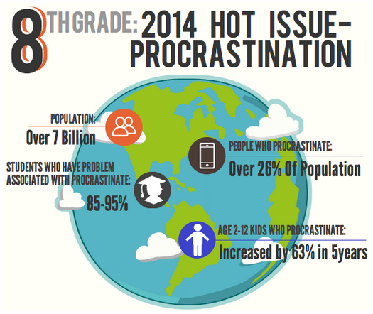
*Infographic created by Esther, Grade 8
Infographics are used quite a bit in reporting health news, as they’re a visually appealing way to get facts and statistics out to the community.
Here are some samples…
Infographic: Meditation in Schools Across America
Infographic: 15 Scientifically Proven Ways to be Happier
Today you’re going to create your own and demonstrate advocacy by taking your posters to a whole new level.
Project: Create Your Own Infographic- Analyzing the Influence of Technology
Student Rubric- Analyze the Influence of Technology
NHES 2.8.6- Analyze the influence of technology on personal & family health.
NHES 8.8.4- Identify ways in which health messages and communication techniques can be altered for different audiences.
Your task: pick one of the topics that we’ve been discussing during our technology balance unit, gather some research, and create an infographic to get your point across.
Here are some possible topics…
-Digital footprint
-Tech balance/ face-to-face communication
-Digital Citizenship
-Time management/tech distractions
-The benefits of video games
-Mindfulness in a connected world
Pick a topic that interests you, do a little research, and find at least four facts or statistics to include in your infographic.
Then use one of these easy to follow programs and get started…
Remember the tools for effective advocacy… don’t forget your audience, make sure your infographic looks good, and cite your sources at the bottom (people respect you more if you back up your facts!)


